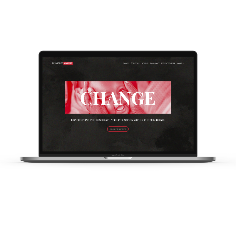
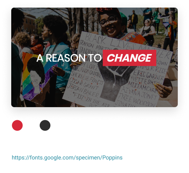
A Reason To Change
A web design case study of a non profit news platform
Role- UI Designer & Front End Developer (Remote)
Team- Solo
Timeline- 3 weeks (currently on hold)
Client- A Reason To Change
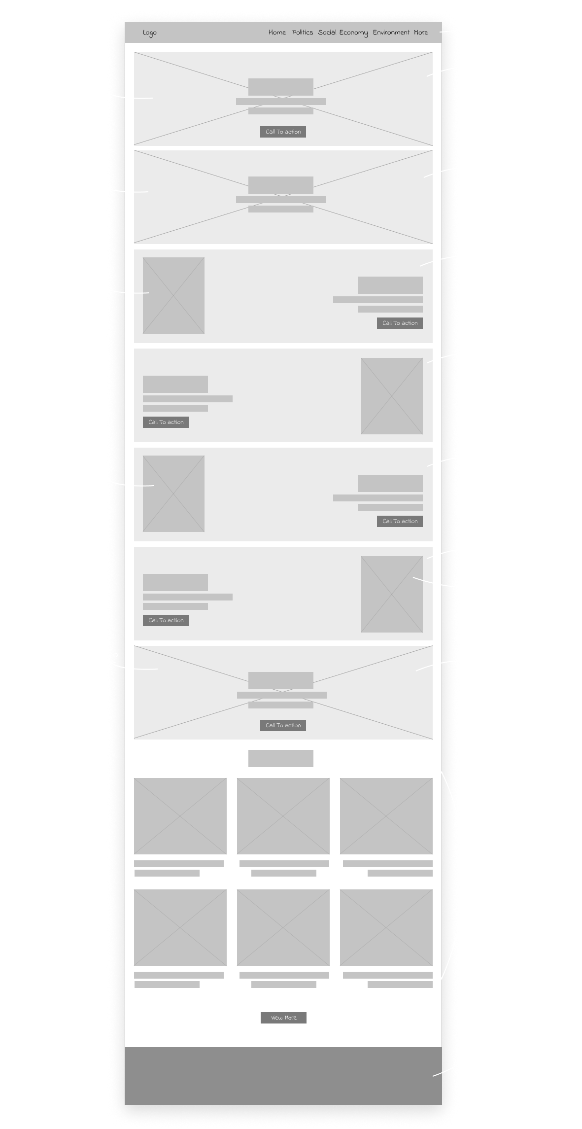
Deliverables- Branding, web design & development
Tools-
01. Introduction
A reason to change is a non profit news platform, which informs and motivates the public to change their attitudes and behaviours towards real world problems, that can no longer sit idly by, in the hopes it can be fixed on its own.

This platform supports all truth, no matter how raw and emotional it may be.
02. Branding
Developing a logo for a news organisation, I had two objectives in mind- making it timeless and to also grab attention. I came up with a series of descriptive words that captured the essence of the ‘A reason to change’ brand: bold, timeless, clean, simple & minimalistic.

After all the rough sketches and iterations the client finally settled for this wordmark logo. A simple abstract logo with the word ‘Change’ bolded and also set in Italics to make it stand out on a red rectangle. The red being a representative of urgency, danger, strength, power and provokes the user to take action, which aligns well with the goals of this organisation.
03. Low Fidelity Wireframes
Finally, the design for the web interface kicks off, starting with the low fidelity wireframes. With only four categories for this website, my only focus for this stage of the design was to understand and work out how to structure the homepage and gain a rough idea of the information architecture and refining it in the later stages of the design process.
04. Mid Fidelity Wireframes
At this point of the design phase I started working on different sizes of the website and how it would look on different devices. Along with that I focused on refining the information architecture and drafting the content of the website. After creating responsive wireframes of the website I began fleshing it out.
05. Styleguide
After designing few pages of the mid fidelity wireframes, I started working on preparing the UI styleguide of the website, that I could use to incorporate into the design. All the components in the styleguide is subjected to change as the website and brand grows.
06. High Fidelity Prototype
The prototype of this website has been directly built on webflow, due to time efficiency, design flexibility without boundaries and also for the ease of making several quick iterations. Please check below to view the link for this website.
Final Note
Since this is still an ongoing project, it is currently on hold. I am unable to share the rest of the progress. This project will be completed and will be launching soon however and I will add the remaining work onto this. You can view the prototype on the link below. Let me know your thoughts and constructive criticism are highly appreciated.
View the website
Next
Logofolio Vol.1
A collection of design challenge for creating thirty logos in thirty days.