Little Joys
Streamlining a multiple niche blogsite, by addressing various user problems and aligning it to business needs following a lean UX design principle from scratch to finish.
Client: Little Joys
Team: Solo
Role: UX and UI designer and front end developer (Remote)
Timeline- 4 weeks
Deliverables- Android app prototype and branding
Tools- Adobe Photoshop, Adobe illustrator, figma & Webflow
Overview
Challenge
Little Joys is a multiple niche blog site, founded by a new upcoming blogger who aspires to have her own platform, with a huge outreach and having a good amount of fan base. But due to the competitive nature of this field, the only way for Little Joys to thrive in this field is to understand what the users need, make content more socially engageable and take into account of the factors that helps grow the site. Therefore to create a responsive website, with the design influenced based on research and testings from this project.
Objectives
- Carry out intensive research on users needs and performance of competitor blog sites.
- Combining quantitative and qualitative data to strategise design.
- Create logo and branding
- Design and build a responsive website
- Design website with readability in mind and make it SEO friendly
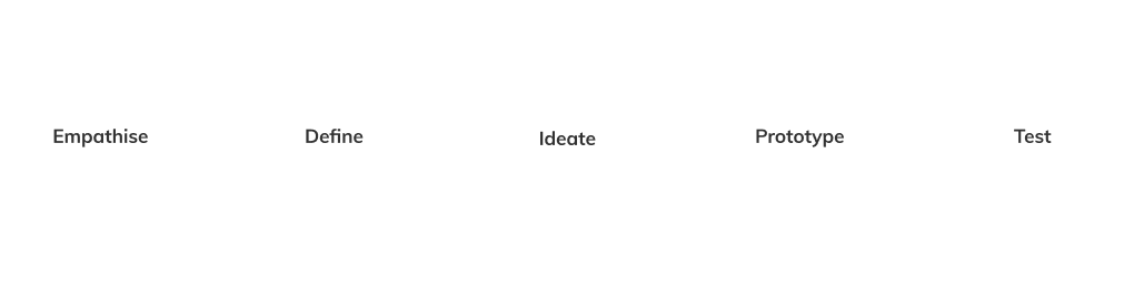
Design Process
Research
During the research phase, I sought to understand the current state of starting up a new blogging platform. My intention for the research phase is to discover and understand the pains and frustrations of what the users go through on a regular basis while coming across different articles from different blog sites, what their likes and dislikes are. And also to understand on how successful bloggers set their sites to excel on performing well and gain traffic.
Goals
- Define people’s common behaviour while reading blogs and visiting new blogsites.
- Define people’s behaviour in terms of social shareabilty.
- Carry out competitor analysis.
- Determine what people like and dislike.
Process
- General Research
- Surveys using Google Forms
- Competitor Analysis
General Research
I conducted a general research to understand user demographics, developments, opportunities, and challenges in the blogging industry. Collected information from articles and case studies to identify industry standards and user expectations.
User Survey
Using Google forms I created a survey and sent it out to users to have a better understanding of the needs and their perspectives of the target audience. The users were selected from facebook groups who were members of different popular blogsites. The participants age ranged from 15 - 62 year old. By the end of the research I ended up with a generous amount of 24 forms, which helped me gather a good insight on user’s behaviours, needs and frustrations.
Quotes directly from users:
“I absolutely hate how I have to go through several ads to read a post”
“Long loading pages are a complete turn off”
“Can’t find a proper share button or sometimes cant even find it to share a good post”
“The search bar never gives me what I am looking for”
“Regret clicking the link to read the article because all I am doing is just staring at the ‘subscribe’ popup that doesn’t have a close button and I strongly refuse to give out my info”
After accumulating all the data that I have collected, I structured out an empathy map to have a better understanding of the users environment and their emotional connection.
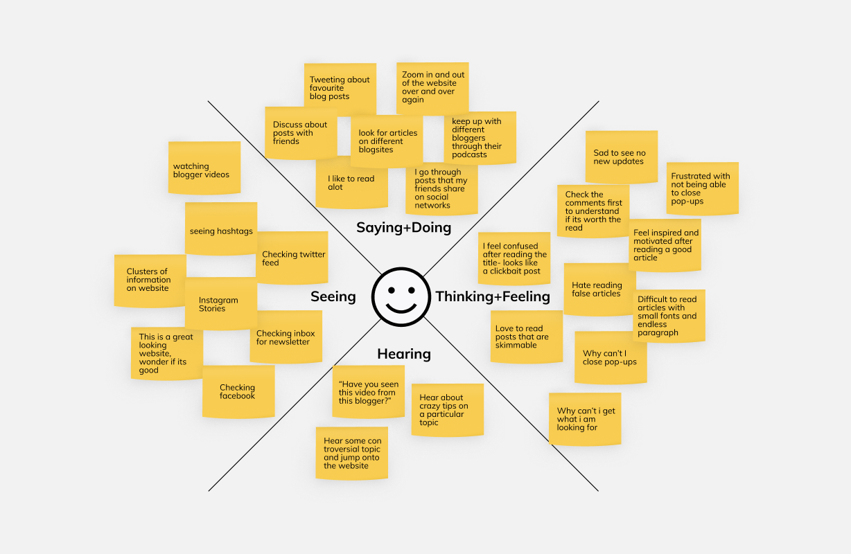
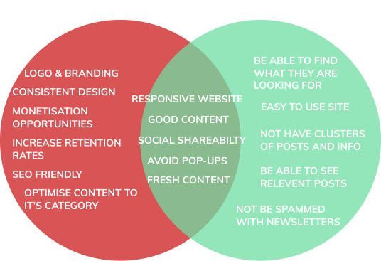
Clustering the survey responses along with general research allowed me to discover trends and patterns from which insights could be constructed. Through this process I identified several user needs and assumptions:
- Users stumble upon new and popular blog sites through social network more than search engines
- Looks of the site matters to the users.
- Sites with good content and bad design results in a one time visit.
- Users on average reads 12 - 80 articles throughout the day.
- Severe amount of popups and ads are not a good thing.
- Misplacement of subscribe button can either drive the user away or leave them confused looking for it.
- Content needs to have proper size of the fonts and spacing between them and presentation of it matters.
Competitor Analysis
I analyzed some of Little Joys competitors in the blogging industry, at the time of working on this project the client proposed to start of the site with 8 main categories (science, food, beauty, travel, art, culture, entertainment and journal). I uncovered the strengths and weaknesses of competitors of different single category blogsites to see how they perform on different factors.
Research Goals:
1. SEO Ranking
2. Website traffic
3. Load Time
4. Mobile responsiveness
5. Frequency of content
6. Social and channel traffic
7. Strenghts and weaknesses
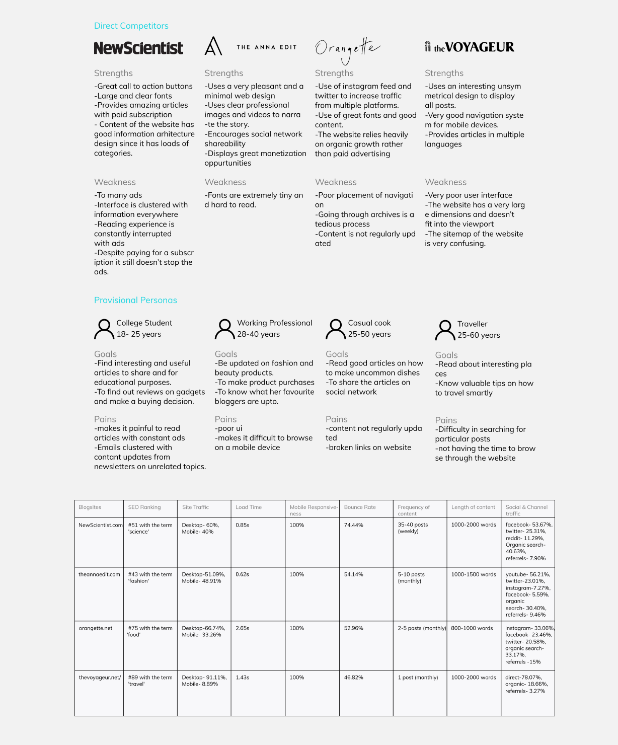
My competitor analysis produced the following insights:
- Social media plays a major part on increasing traffic
- Responsive websites are a must and it drastically increases retention rates
- Its very critical to have a clear call to action button and where it is placed
- Indexing website to search engines also increases website traffic
- Learning to optimise videos and images so websites can load up faster
- optimising content to the right category and displaying relevant information in order to reduce bounce rate.
- Design problem sites only have one time visitors
- 23% internet time is spent on blogs and social networks
- Articles with images and videos increases the chances of share ability
Based on the data that I had collected through research I went ahead and created few provisional personas which gave me a good idea on the various needs of different kinds of demographics and how to appeal to them from a business point of view.
User Persona
Next, I used all of the qualitative data I gathered during the research process to create two personas which gave me a good idea of what the users expectations and requirements are and to focus on narrowing it down on how to choose the right solution.
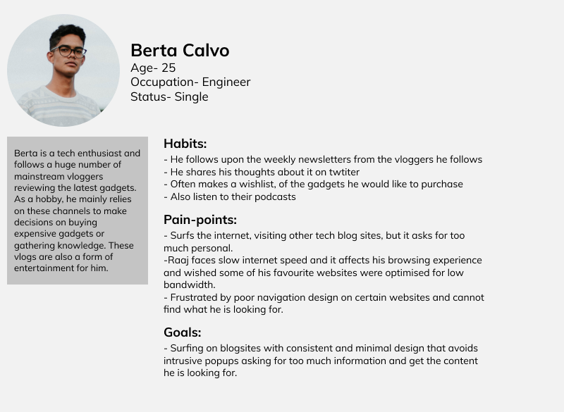
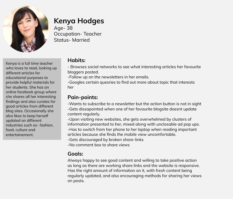
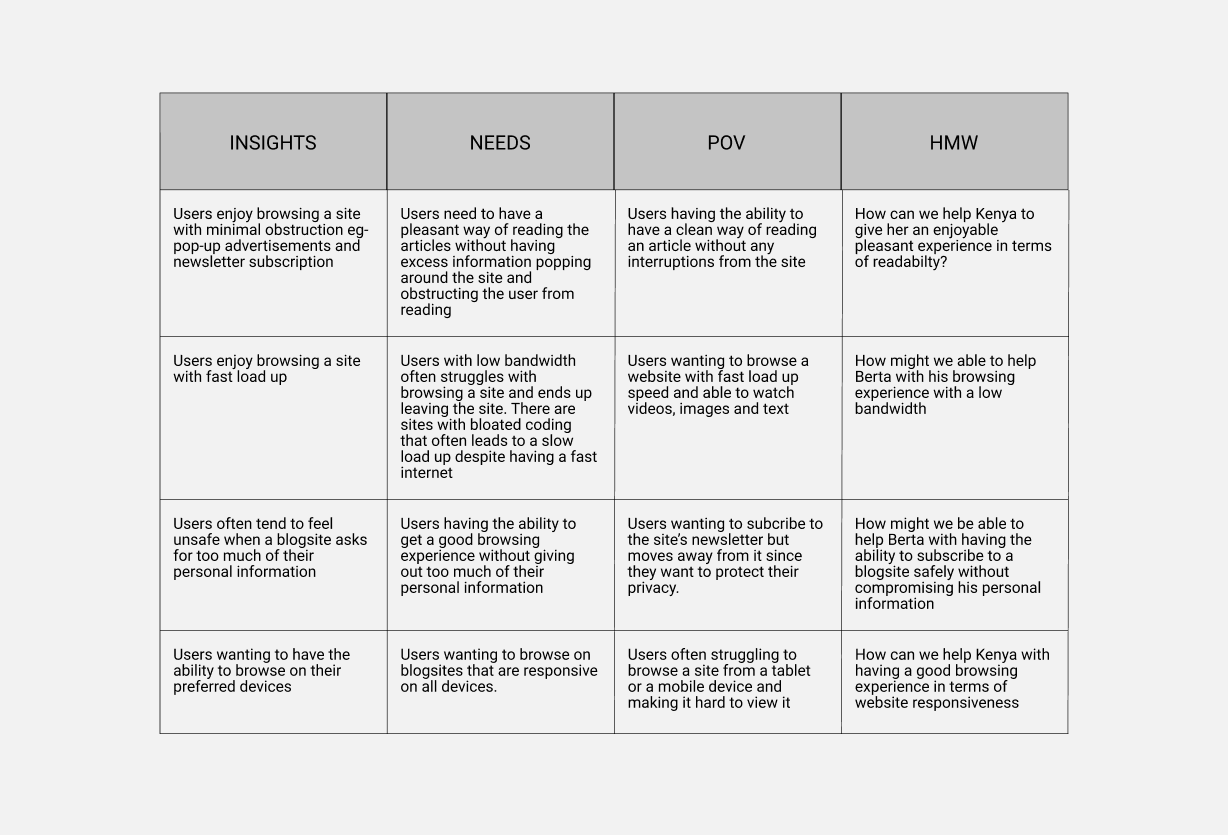
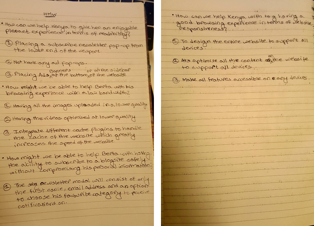
After I finished constructing the user personas, I referred to their paint-points and their goals converting those insights into POV statements, an actionable problem statement that defines the design challenge. Next, I restructured those POV statements into How Might We questions that would generate solution-oriented brainstorming.
After my brainstorming session I listed down all the possible solutions in the given time frame.
Define & Ideate
Now that I had empathised with target users and identified their needs, I needed to define the solution. I reflected on the business goals, user goals, and technical considerations to find a happy medium for all stakeholders. Once I had identified common goals, I could decide what product features were necessary for the website.
Goals
Combining all the quantitative and qualitative data that I have gathered from the research phase and work on a strategy for ideating and defining the blog site.
Process
- Business and User Goals
- Feature Listing
- Information Architecture
- Hybrid Card Sorting
- Sitemap
User Persona
After collecting all the qualitative information from the research phase, I have synthesised the data to two personas that reflects the problems perfectly. Nathan, an athletic asthmatic and Karla who is a caretaker for her son suffering from asthma. By adding context and personality to the data we can empathise with the target users and have a better understanding. Although it is important to keep in mind that these two personas are most likely not the solution to the various demographic needs of other patients with severe asthma, due to time limitations I only focused on the target users that I gathered from my research. In the future, Breathe Easy will have to go through more research and iterations for better usability.
Technical Goals
- Have a minimal design
- Compress images and videos for website to be optimised for low bandwidth
- Website meets W3C Web Content Accessibility Guidelines so users with disability
can use the site
- Work on a system for optimising email newsletters
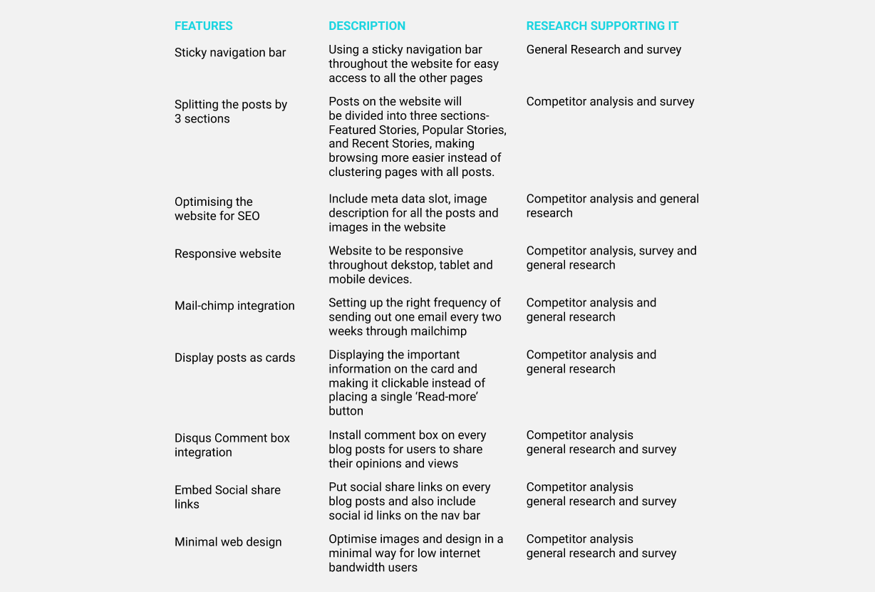
Features & Information architecture
I created a list of site features to further define and guide the vision for the product. Explaining the features with supporting research created a clear order of execution.
Findings
After having three rounds of card sorting, it cleared up alot of assumptions I had in regards to understanding how users perceive and expect from the homepage, the kind of information they would like to see about every article on the fly before clicking on it to check it out. Most of the participants had different structure in regards to how the information should be laid out on each and every page of the website.
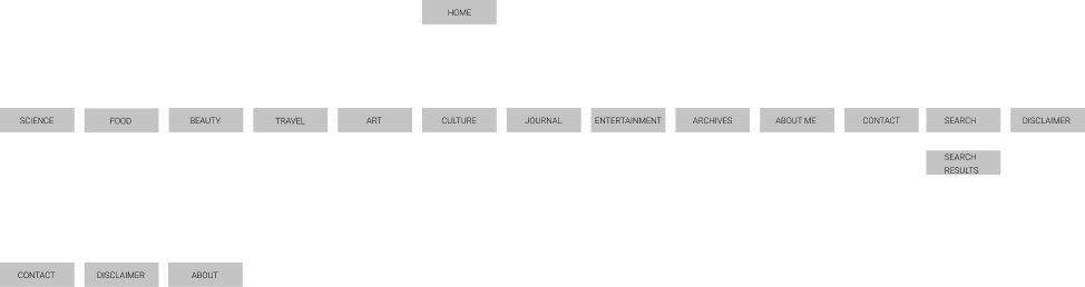
Sitemap
Based on the straightforward categories along with additional pages - contact, archives, disclaimer and about me, I created a site map which laid out the structure of the site.
Design & Prototype
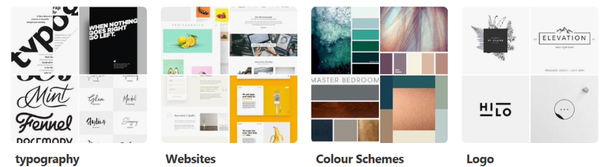
At this point in the process, I began thinking about how the website would look and feel to visitors. I came up with a series of descriptive words that captured the essence of the Little Joys brand: simple, minimal and a versatile design
With these adjectives in mind, I created mood boards on Pinterest where I collected pins of typography, logos, and color schemes that aligned with my vision for Little Joys.
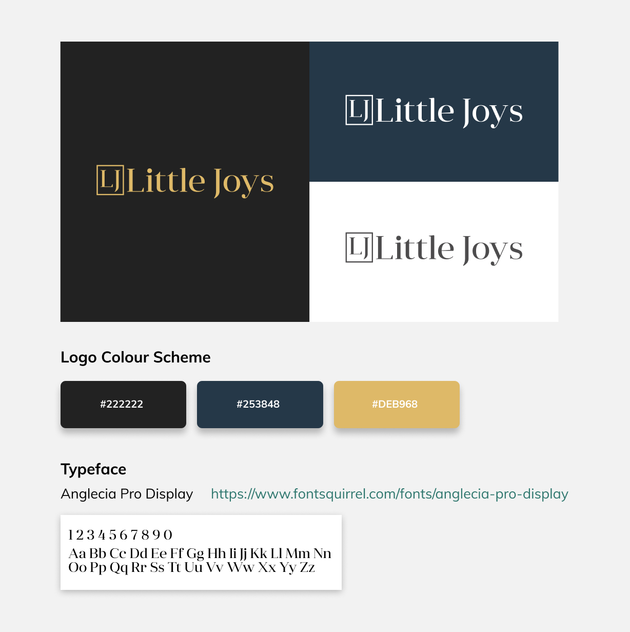
After the sketches and alot of iterations the client was pleased to have a simple combination of a logomark and a logotype.
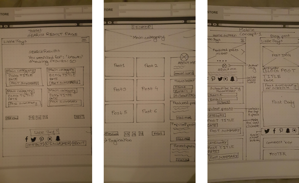
Low Fidelity wireframe
I began the process of wire framing with sketches of variations of the website landing page. During this process, I thought about how the layout and content could be structured to satisfy user and business goals in a technically feasible way. The sketch I chose served as a guide for my digital wire frames.
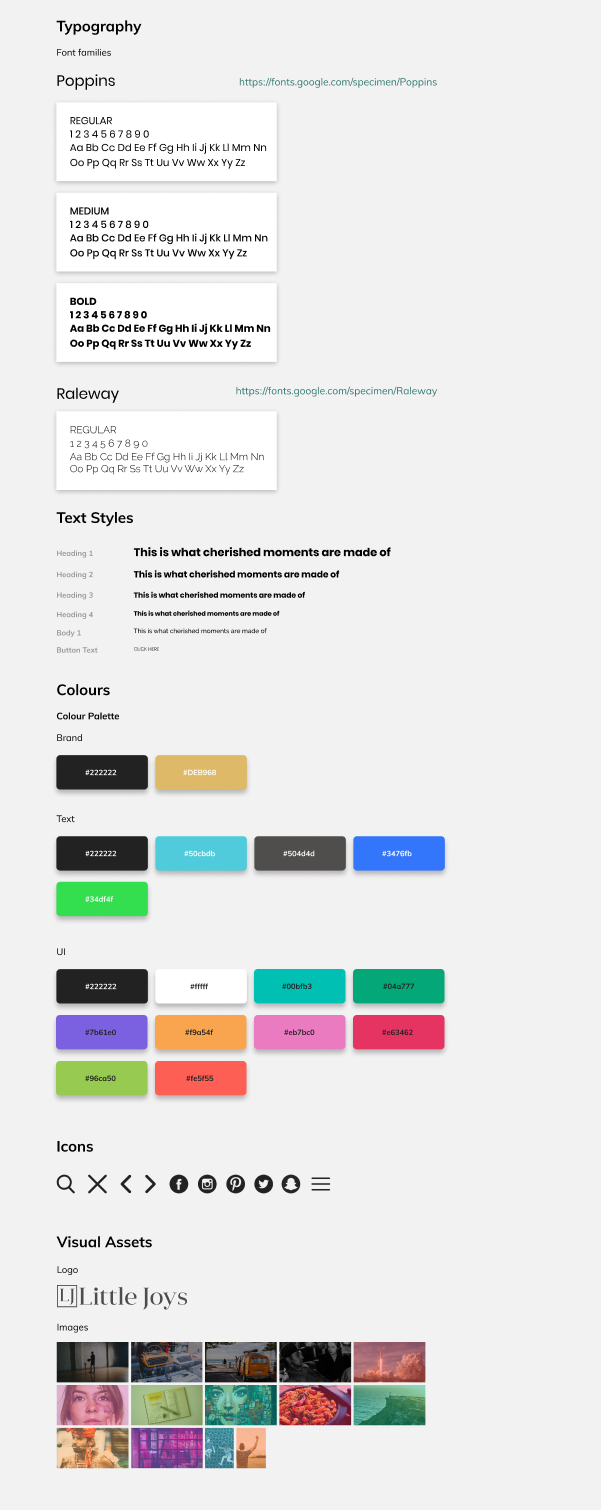
Styleguide
Mid Fidelity wireframe
At this point in the design process, I needed to think about how I wanted the site to look on different screen sizes. It was essential that the website would present as well on tablet and mobile devices as it did on desktop, therefore approached the method with a mobile first design. I also showed these designs to my peers to gain insights on how effective this design is and if there are ways I can improve.
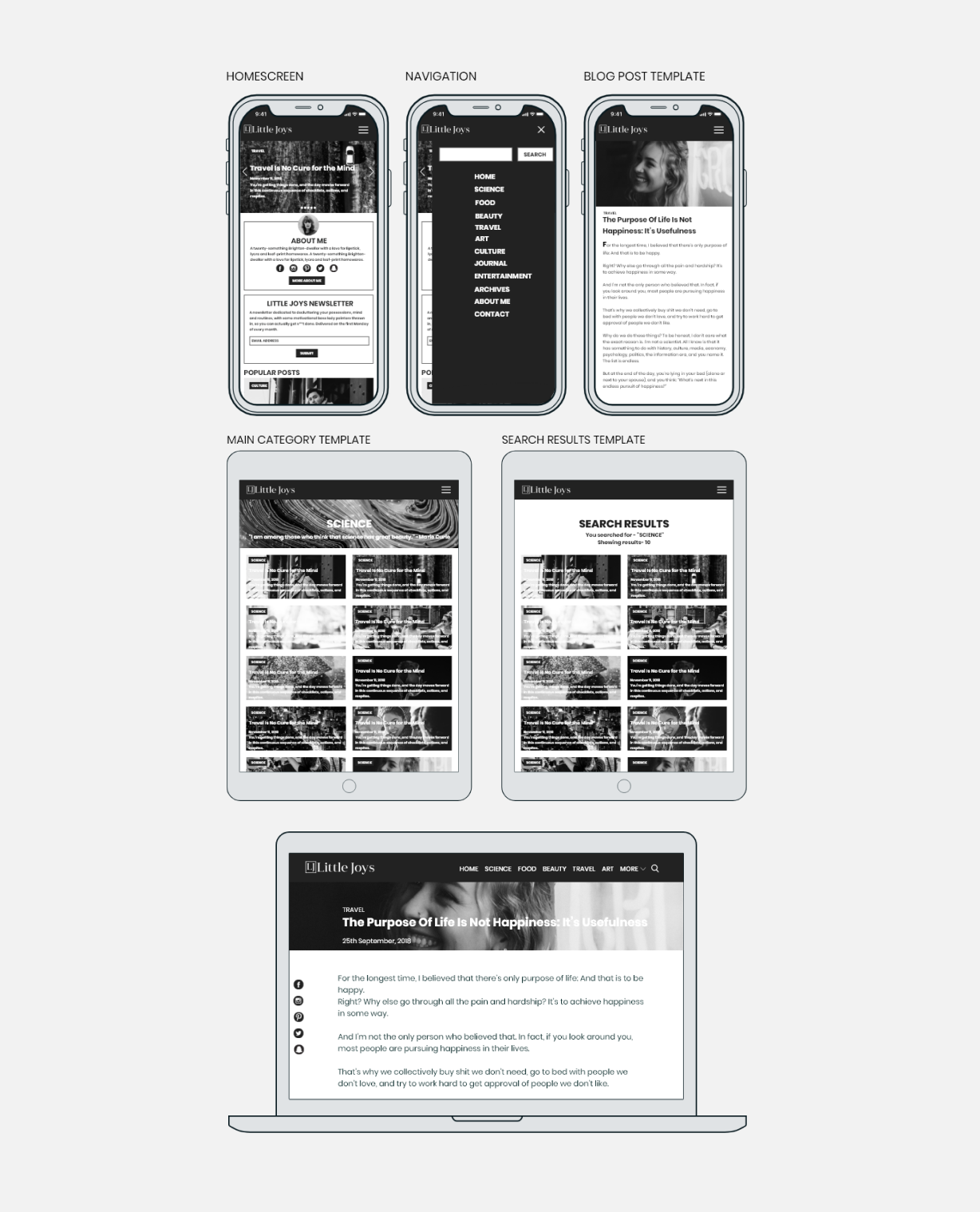
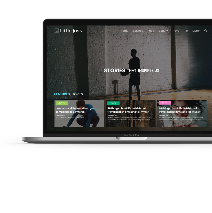
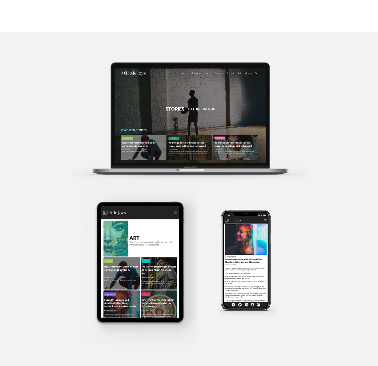
High Fidelity Prototype
Once I have finished creating the wireframes of the website I decided to develop the entire blogsite directly on Webflow ( a platform for designing websites) which would also serve as a prototype and run it for testing and keep iterating after few usability tests.
Testing & Iteration
After developing the website entirely on Webflow, I proceeded with the usability testing. Filling out the site with over 30 dummy posts for different categories, I asked 5 participants to test out the prototype's usability. The participant pool was comprised of both men and women between the ages of 18 and 65 who frequently read various articles on a daily basis. The testing was done remotely on Skype.
Usability Testing
For the 5 participants chosen for the testing (who had similar backgrounds to our personas) they were given three different scenarios and were asked to complete the following tasks:
- Browse the site to read the articles of categories that interests them
- Use the search bar to find a post
- Share their opinion through the comment box
- Share a post on social network
- Signup for the newsletter
Affinity Mapping
I created an affinity map to organise and synthesize the responses and observations I captured using testing. I uncovered insights, which I reconstructed into a list of recommendations. I organised these by priority level (high to low) as a way of determine what needed to be changed immediately and what could be saved for later.
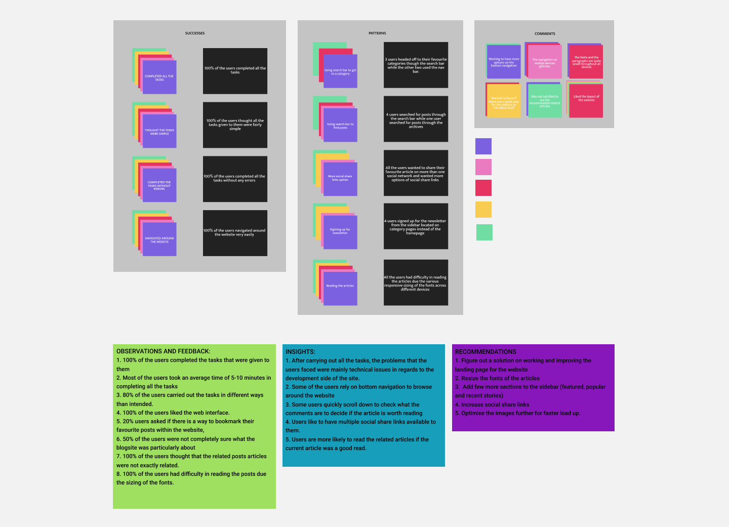
Findings
Overall, users navigated through the website with ease. Most of the problems were from the technical side of the web development which rendered on poor readability for the users, with them also recommending on how to improve certain other features.
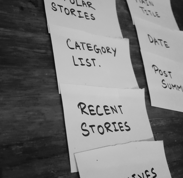
Recommendations
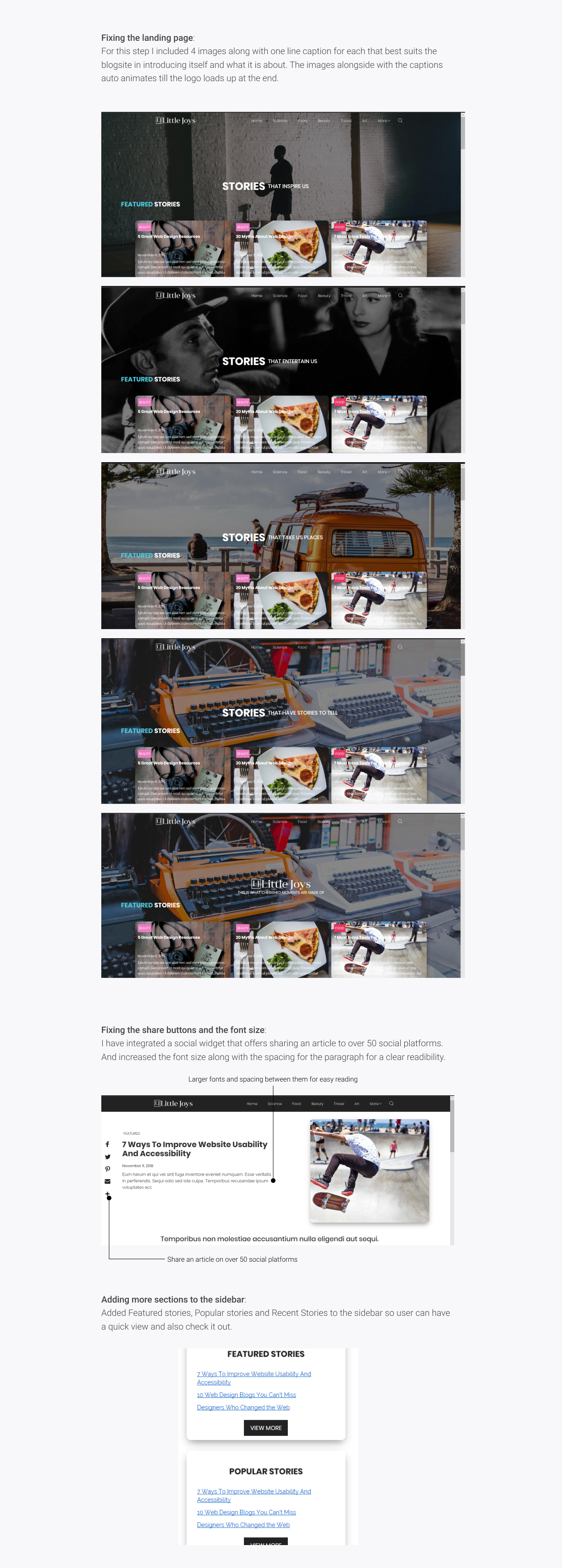
1. Figure out a solution on working and improving the landing page for the website
2. Resize the fonts of the articles
3. Add few more sections to the sidebar (featured, popular and recent stories)
4. Increase social share links
5. Optimise the images further for faster load up.
Iterations
Finally, I revised the wireframes and the Webflow prototype based on the recommendations drawn from the affinity map. The changes are shown below.
Current update on the project
After running the usability tests and gathering insights on how to improve the website. The client was confident enough to push the website for the final development along with the new iterations to a Wordpress hosting. Currently the blogsite is fully developed and is awaiting for content from the client. It will be launching in July 2019.
Takeaway
Building a blog site for Little Joys was a relatively straightforward project because many features have well-established design patterns. Therefore, I gained much experience in researching best practices and determining which solutions were best based on user needs. Additionally, since many people have browsed through blog sites before, user expectations are more concrete, which makes it even more important for the website to reflect common blog design patterns. As I learned from this project, usability testing can be a big help in discovering areas that are inconsistent with user expectations. Overall, I gained much perspective and understanding about the blogging experience.
View the website
Next
Asani
Designing a shopify store for a company with over 10 stores all around UK and gaining popularity in women's clothing, Asani decides to tap into the digital space to expand their business as they recognise the potential online revenue.
Previous
BreatheEasy
Designing a saas android mobile app from the NHS that focuses on individuals suffering from asthma and helping them manage their illness with ease.