BreatheEasy
Designing an android mobile app for asthmatics to have better control and be able to monitor their asthma and improving the quality of life.
Client: NHS
Team: Solo
Timeline- 4 weeks
Role- UX & UI Designer (remote)
Deliverables- Android app prototype and branding
Tools- Adobe Photoshop, Adobe illustrator, figma, Invision and Zeplin
Overview
Challenge
BreatheEasy is a saas android mobile app from the NHS that focuses on individuals suffering from asthma and helping them manage their illness with ease. The product collects information, monitors and helps the user manage their condition, through multiple devices- a wearable patch, bluetooth sensors for inhaler, peak flow meter and a mobile app. I was given the task to design an app and to build a prototype for the NHS for asthma managment in combination with the wearables for asthma patients, and helping them control their symptoms and improving the quality of life.
Objectives
- Have a comprehensive understanding on asthma, it’s causes, and how to control it through intensive research
- Design and build an android prototype
- Build the branding and logo
- Follow google’s material design for the app design
- Enabling users to manage and monitor their symptoms with ease and providing them a seamless experience
Design Process

Research
In the research phase, I sought to understand more about asthma, it’s causes and treatments. Also learning about its medical market standpoint in asthma management apps and how it succeeds and what are its weaknesses, trying to develop a strategy on how to make our app better with different solutions and encourage consistent usage.
Goals
- Understanding asthma and what are the symptoms and how to control it.
- Learning the strengths and the weaknesses of other asthma management apps.
- Understanding the type of information that would be valuable for patients.
Process
- General Research
- Competitor Analysis
- Contextual Interviews
General Research
As an individual who doesn’t suffer from asthma, my knowledge about it was extremely limited. So in order to create an effective product I had to carry out a general research and aim to learn more about it, so I can ask the right questions which would help me construct a good solution in the designing process. Also collecting information from articles and case studies to strengthen my understanding on user expectations and the medical industry.
I aimed to understand more about:
- the effects of asthma, the symptoms, treatments, types, triggers and what are the goals for the treatment.
- How asthmatic patients monitor and manage their symptoms in a daily basis.
- What vitals needs to be recorded in order to be able to track progress.
What is Asthma
Asthma is a common lung condition that causes occasional breathing difficulties.
It affects people of all ages and often starts in childhood, although it can also develop for the first time in adults.
There's currently no cure, but there are simple treatments that can help keep the symptoms under control so it doesn't have a big impact on your life.

Asthma attacks kill 3 people in the UK each day. But many of these deaths could be avoided.
Every 10 seconds someone has a potentially life-threatening asthma attack. Find out what your risk of having an attack is using Asthma UK's asthma attack risk checker.
If you're on the right asthma treatment, your chance of having an attack is greatly reduced. Visit your doctor or asthma nurse at least once a year for a check-up and to discuss your treatment.
Competitor Analysis
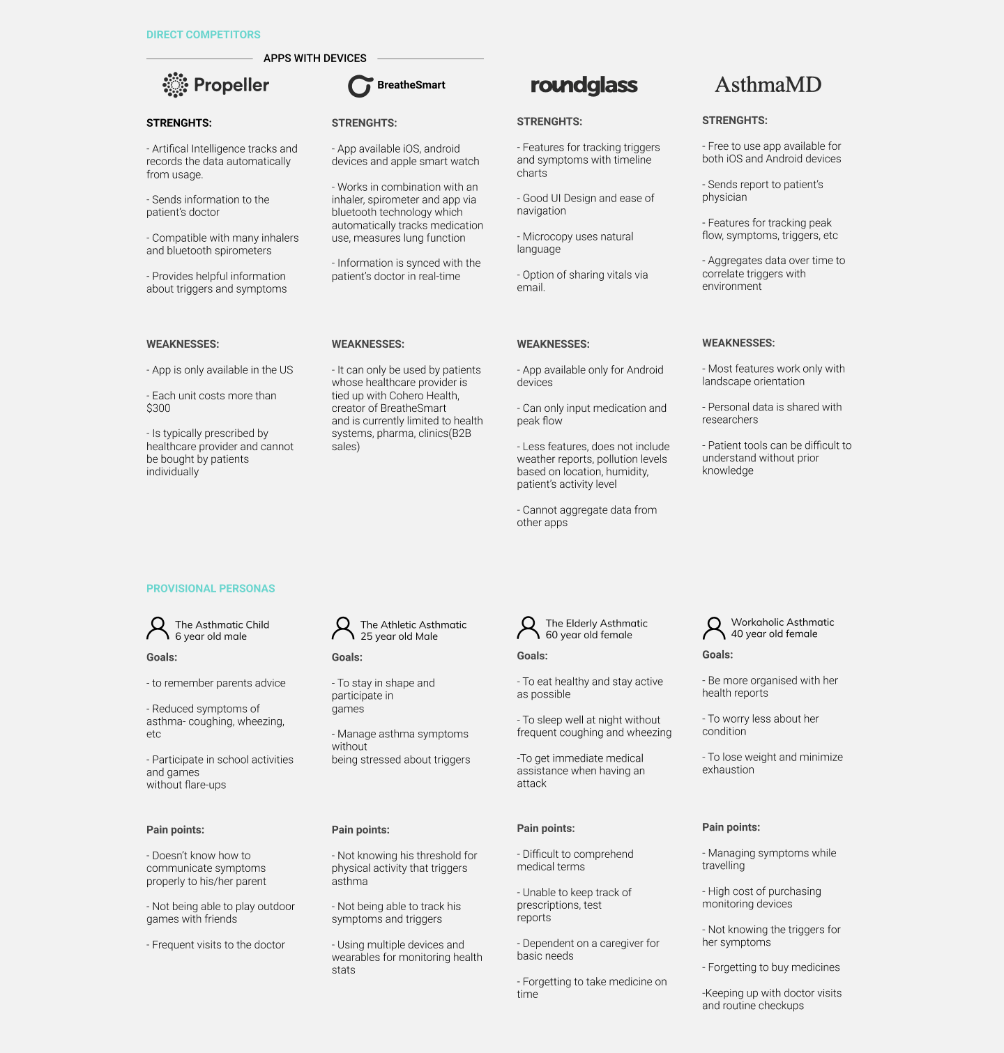
I conducted a competitor analysis to understand how BreatheEasy stacks up to the current competitors with their own set of different asthma management solutions and understanding their strengths and weaknesses. This gave me an insight of what is to be expected from the app and how it functions alongside with wearable tech. I also created provisional personas that I gained from general research which gave me an idea of the target audience and how to appeal to different demographics with various needs.

My competitor analysis produced the following insights:
- Self care is essential for asthmatics therefore they would like to use an app that educates them in understanding what triggers their symptoms.
- Users want external devices to be able to know what their health stats are like and whether they need to take any action on it without knowing the doctors review.
- Devices for monitoring symptoms are very expensive and sometimes not available in alot of regions
- Better and efficient monitoring so that it enable users to be more social and be able to participate in activities that does not cause asthma flare-ups.
Contextual Inquiry Interview:
After gaining a good idea on the matter from my initial research I constructed an interview guide and conducted an interview with 3 participants who are asthma patients in order to gain solid insights to understand their struggle in maintaining their lifestyle and work out ways to improve it. The participants for the interview comprised of two males and one female from the age of 25-75 years old.
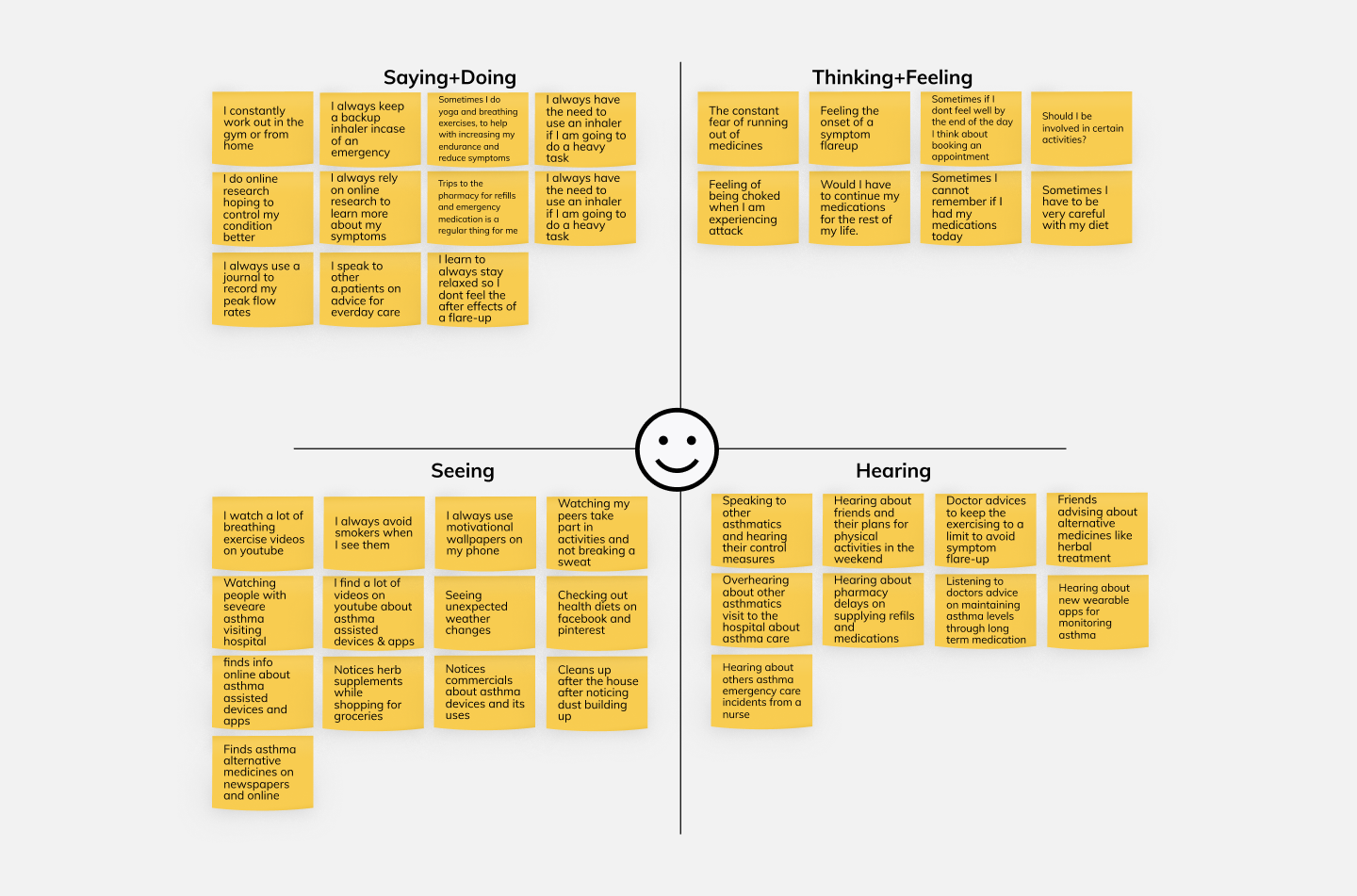
After completing the interviews I jotted down all of the responses on sticky notes and began to cluster them based on topic to create an empathy map.

Insights gained from the empathy map:
Patients are always aware of their surroundings and have the constant need to avoid anything that might trigger their symptom flare-ups
- Patients are always on the lookout for new technological advancements that might help them with their illness e.g- wearable tech, herbal medicines, mobile app etc.
- Biggest challenge the patients face is to remember their medications and always be able to keep track of it.
- Always carrying backup medication incase there might be an emergency.
- Most patients aren’t familiar with a lot of the medical terms.
- They are always scared of participating in any form of intense physical activity.
- Always consulting and discussing control measures for asthma with doctors, nurses, online forums and others who suffer from it as well.
Define & Ideate
After wrapping up the research phase learning about the pains and needs of asthmatic patients, I compiled the data to further recognise and define the target users which enabled me to create the features of the product and how it might help the users.
Goals
- Understand the needs and define target users
- Mind mapping the product features, information architecture, sitemap and user flows
Process
- User Persona
- POV and HMW
- Sitemap and Userflows
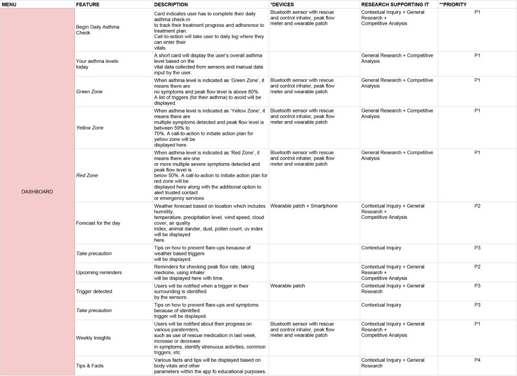
- Feature Roadmap
User Persona
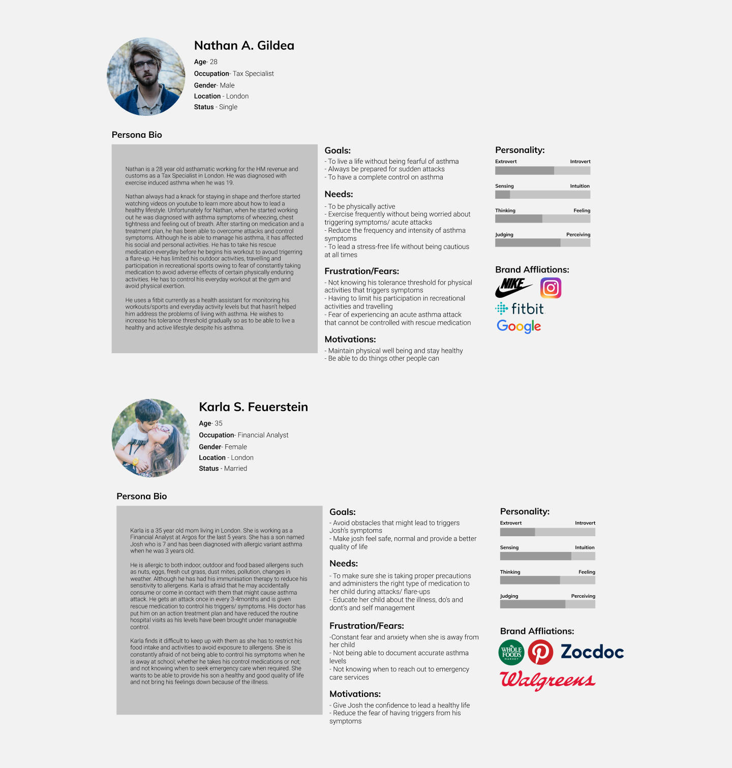
After collecting all the qualitative information from the research phase, I have synthesised the data to two personas that reflects the problems perfectly. Nathan, an athletic asthmatic and Karla who is a caretaker for her son suffering from asthma. By adding context and personality to the data we can empathise with the target users and have a better understanding. Although it is important to keep in mind that these two personas are most likely not the solution to the various demographic needs of other patients with severe asthma, due to time limitations I only focused on the target users that I gathered from my research. In the future, Breathe Easy will have to go through more research and iterations for better usability.

Point of view and how might we questions
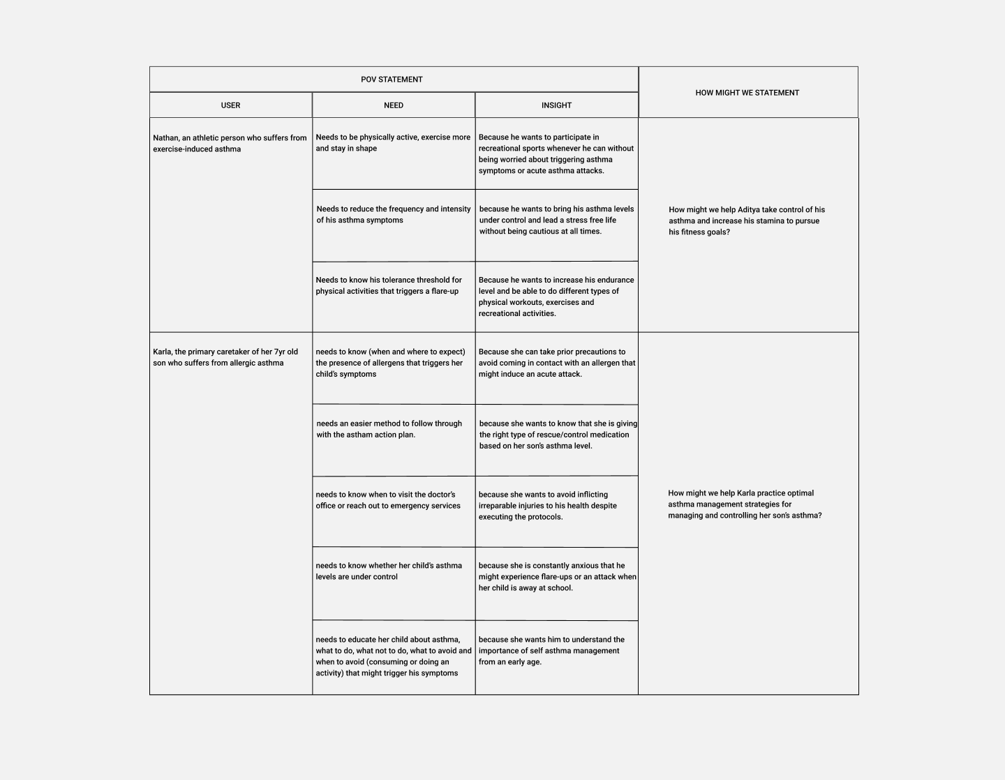
After constructing the personas I dug deeper into the needs and insights that I had generated, and restructured them into point of view statements, an actionable problem statement that defines the design challenge. Later I took these pov statements and generated how might we questions which helped me to create a solution oriented brainstorming and also build the mvp features for the product


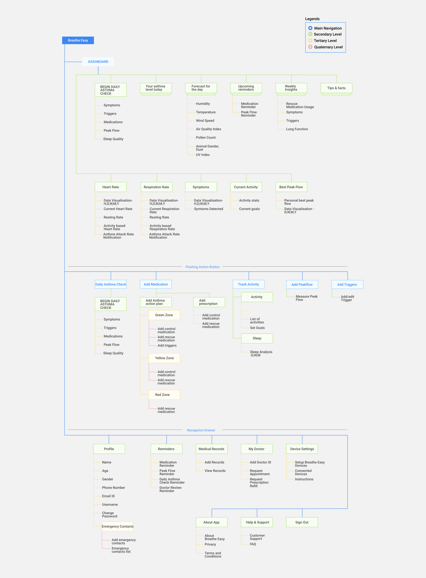
Sitemap
I created a sitemap that incorporated all the high priority features that I have created in the feature road map

Interaction Design
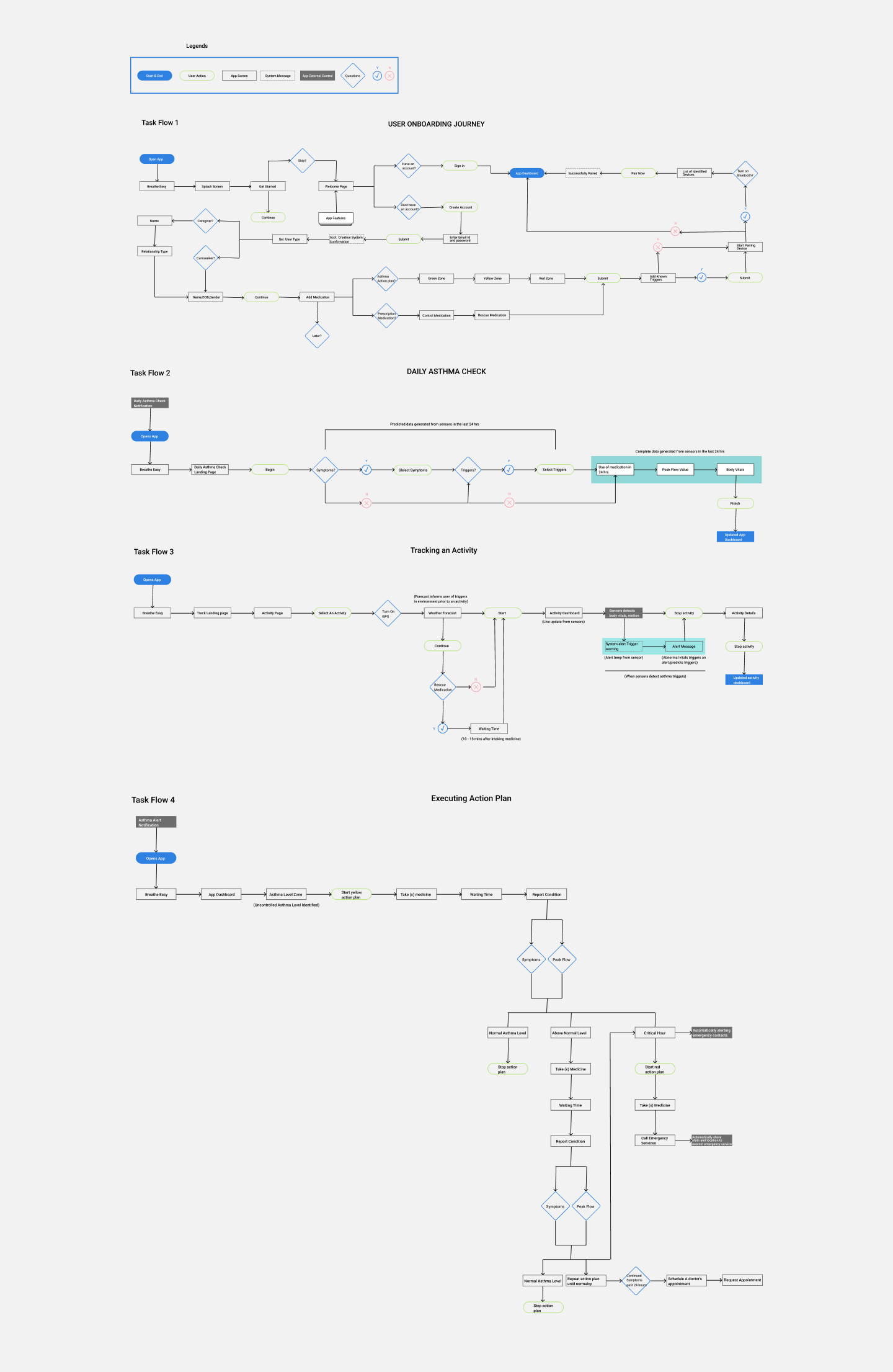
Based on the common scenarios I found from the research phase I mapped out 4 task flows to analyse the flow throughout the app. Understanding the user actions for each task flows gave me a better insight as to how the user would interact with each screens and be able to develop a good idea on how to craft an intuitive experiences through the UI.

Design & Prototype
Visual Branding Design
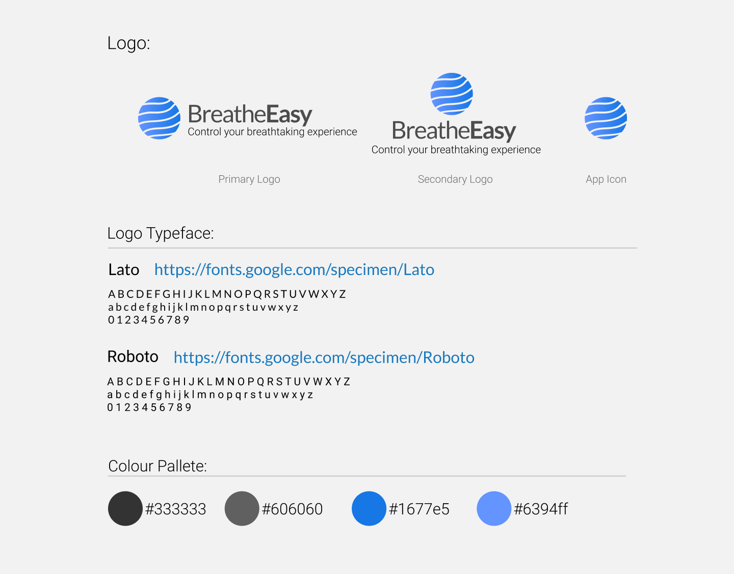
For the logo I focused on a wordmark along with an abstract icon that I feel best represents the meaning of BreatheEasy. The waves in the icon is a depiction of the air surrounding us (also representing the environment) which is enclosed in a circle. With blue as the primary colour, as it represents depth, stability and cleanliness, which is considered beneficial to the mind and body. BreatheEasy devices provides people with asthma the opportunity to live a healthy life by overcoming the barriers in the environment that triggers their condition.

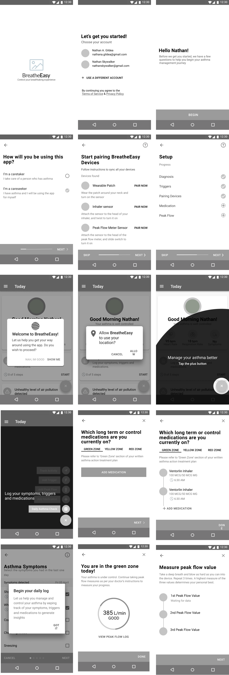
Mid Fidelity wire-frame
Due to the tight time frame of this project, I had initial sketches of few screens drawn on a piece of paper and later on started designing the mid-fid prototype on figma, due to it’s strong collaboration feature I was able to get it checked and tested out by my peers and gain constructive feedback at an early stage of the design. I closely followed google’s material design guidelines for a clean intuitive UI.


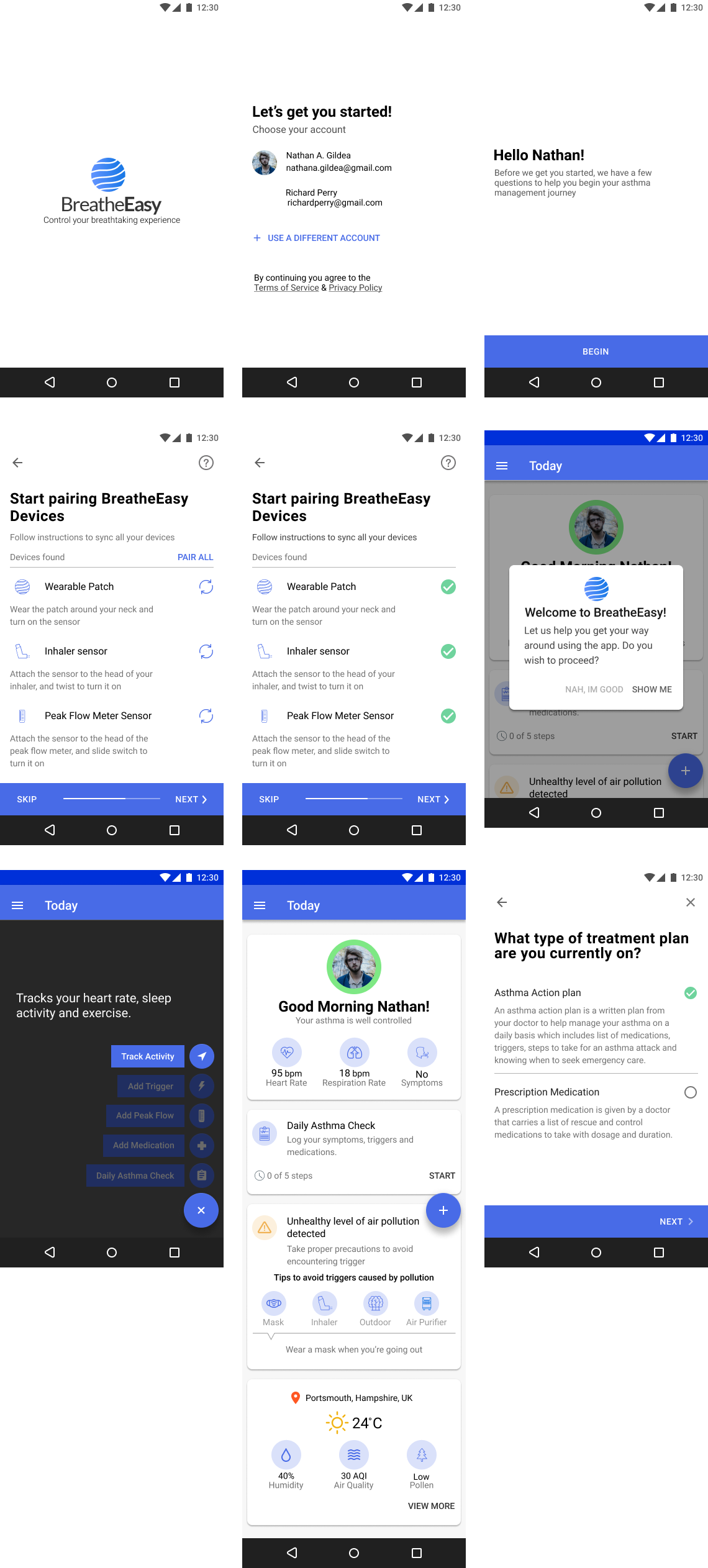
High Fidelity prototype
After gaining feedback on the design I have implemented the changes onto the high fidelity prototype and uploaded it on invision. The following screens has been uploaded:
- User Onboarding
- Adding Medication
- Daily Asthma Check
- Starting an Asthma Action Plan
- Measuring Peak Flow.

Testing & Iteration
At this stage of the design, after completing the high fidelity prototype I ran the usability testing with 3 participants. The test was carried out to examine usability, navigation, content & call to action in the built task flows; identify errors and gain user’s feedback on their preferences and recommendations and assess the overall success of the prototype. The test was conducted via a moderated remote setting.
Usability Testing
The participants for the usability testing were the same participants recruited for the interview and were asked to complete the following tasks:
- Download BreatheEasy app from Google Playstore and setup your profile.
- Add your current medication details in the app.
- Log your everyday treatment progress in the app.
- Initiate yellow action plan when asthma symptoms are uncontrolled.
- Measure your peak flow and find your personal best reading.
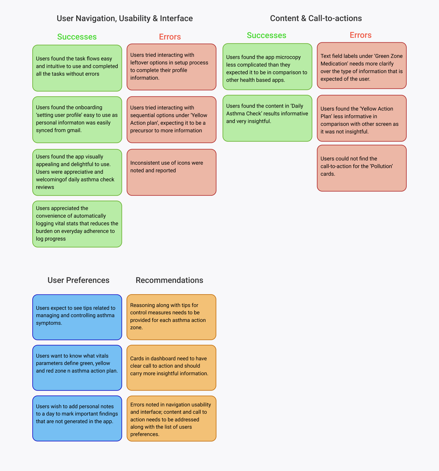
Affinity Mapping
I created an affinity map to organise and synthesis the responses and observations, I captured during testing. I uncovered insights, which I reconstructed into a list of recommendations so that it can be implemented on to the prototype.

Takeaway
In this project I was challenged with a subject matter that I wasn’t familiar with, which is why I had to dive into a lot of research in order to completely understand more about people suffering from asthma. I paid more attention to gathering research and empathising with a target user group that I couldn’t directly relate to as somebody without asthma. A key goal moving forward would be to develop data visualisation for symptoms, peak flow, triggers and medication to help user's track their treatment progress over a period of time. Consequently, usability testing is even more necessary to understand how the product can accommodate different levels of needs.
Next
Little Joys
Designing & developing a website for an upcoming blogger aspiring to have her own blogging platform but in order for it to thrive in this competitive space is to understand the user needs, make content more socially engage-able and to take into account of the factors that will help her platform grow.


