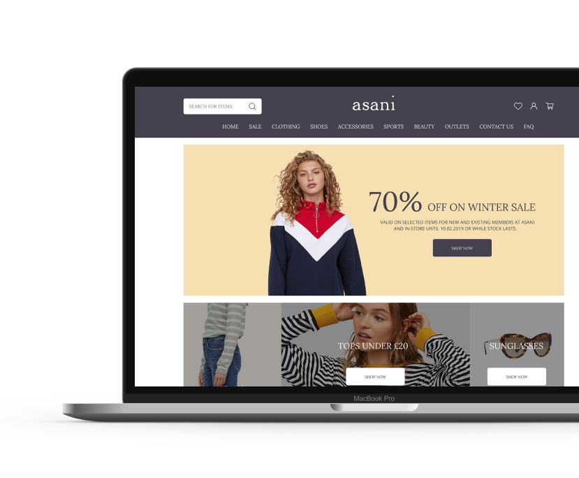
Asani
Designing an ecommerce shopify store for women and to create an intuitive and efficient shopping experience for users
Client: Asani
Team: Solo
Role: UX and UI designer (Remote)
Timeline- 4 weeks
Deliverables- Website prototype
Tools- Adobe Photoshop, Adobe illustrator, figma, Invision & Zeplin
Overview
Challenge
Asani is a successful clothing store for women, based in London, with over 10 stores all around UK, providing in a variety range of unique designer made clothing. The company’s main motto is to provide fashionable clothing at an afforable rate and due to its increasing popularity they have decided to expand their business onto the digital space and recognising the potential of their possible online revenue.
Objectives
Design a responsive ecommerce platform on Shopify, in order to increase more revenue, attract new customers, sell excess inventory and have the ability to deliver worldwide.
Design Process

Research
During the research phase, I aimed to understand the current state of the e-commerce retail industry. My purpose for the research phase was to uncover the needs and frustrations of the target user to better understand how to appeal to them.
Goals
To research the current market and audience of online clothing stores
Process
- Market Research
- Competitor Analysis
- Contextual Inquiry Interviews
Market Research
First, I conducted a market research to understand user demographics, developments, opportunities, and challenges in the e-commerce retail industry. collected information from articles and case studies to identify industry standards and user expectations.

Competitor Analysis
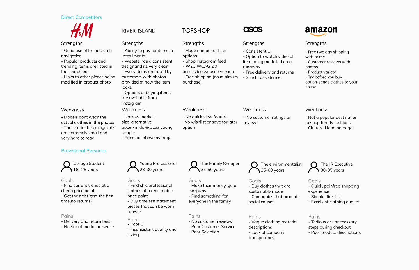
I analyzed some of Asani’s competitors in the e-commerce retail industry. I uncovered the strengths and weaknesses of Asani’s direct competitors H&M, River Island, Topshop, Asos, and amazon. Based on the data I had collected through research I also went ahead and created a few provisional personas which gave me a good idea on the various needs of the different demographics and how to appeal to them from a business point of view

My competitor analysis produced the following insights:
- Integrating social media on to the site because users wanting to have the ability to buy the looks they see worn by their favourite influencers, which helps with the reputation of the brand, and also engaging with the customers.
- Having a feature with helping the customers in understanding the sizing of their items for them to shop their favourite looks.
- Helping customers with custom made clothing theme, to enrich their online experience and achieve the look they want.
- Providing a painless checkout has always been a major asset to different ecommerce stores on top of that providing customers with instalment payment plans makes fashion accessible and affordable in a new way.
Contextual Inquiry Interview:
To have a good understanding of the target audience in order to create an effective website providing a pleasant online experience I had to speak to them directly. The participants for the contextual interview mainly comprised of 6 women between 25 and 50 yeras old and enquiring about their online shopping habits and experiences
Research Assumptions
- Online shopping is preferred compared to in-store shopping according to users
- A large selection of custom theme clothing and accessory styles are preferred
- The most important thing to users are price and quality
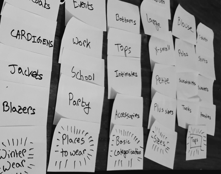
After the interview has been completed I jotted down all the responses onto sticky notes and began to cluster them based on topic.

By gathering all the responses from the interview it helped me discover trends and patterns which helped me to construct insights and also identify several user needs:
- Users need friendly helpful staff to help in stores, whereas online the features of helping users from browsing to the checkout process should be present.
- Having a proper guidance in terms of sizes of clothing greatly helps users to fit their body types.
- Due to shipping and return complications users would like to know if the both the processes will be simple and straightforward.
- Users expressed the desire to have their shopping environment to be straighforward and stress free with having the ability to find the items easily.
Persona
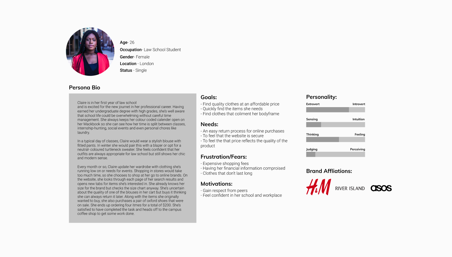
For the next step I created ‘Claire’ to represent the findings from the empathy map. Claire reflects Asani’s target demographics and is characterised by the most common traits and behavious from the participants from the interview. To enhance my understanding and be able to empathise better with the target users I added context and personality to the research data.

Storyboard
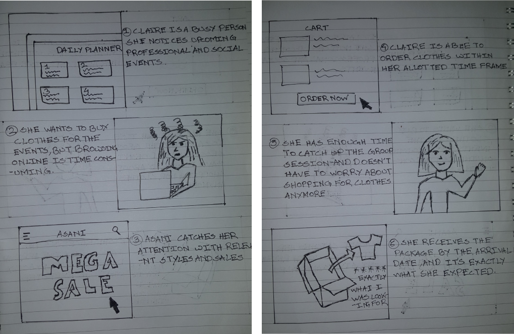
I drafted a storyboard illustrating Claire’s shopping experience to quickly communicate a perceived user problem and how Asani’s website can pose as the solution to this problem.

Define & Ideate
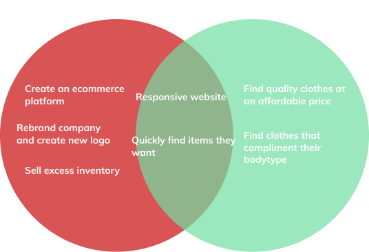
Now that I empathised with the users and identified their needs, I used the data to further define the business goals, user goals and technical considerations to find a good spot for all the stakeholders.
Goals
Combining all the quantitative and qualitative data that I have gathered from the research phase and work on a strategy for ideating and defining the website.
Process
- Business and User Goals
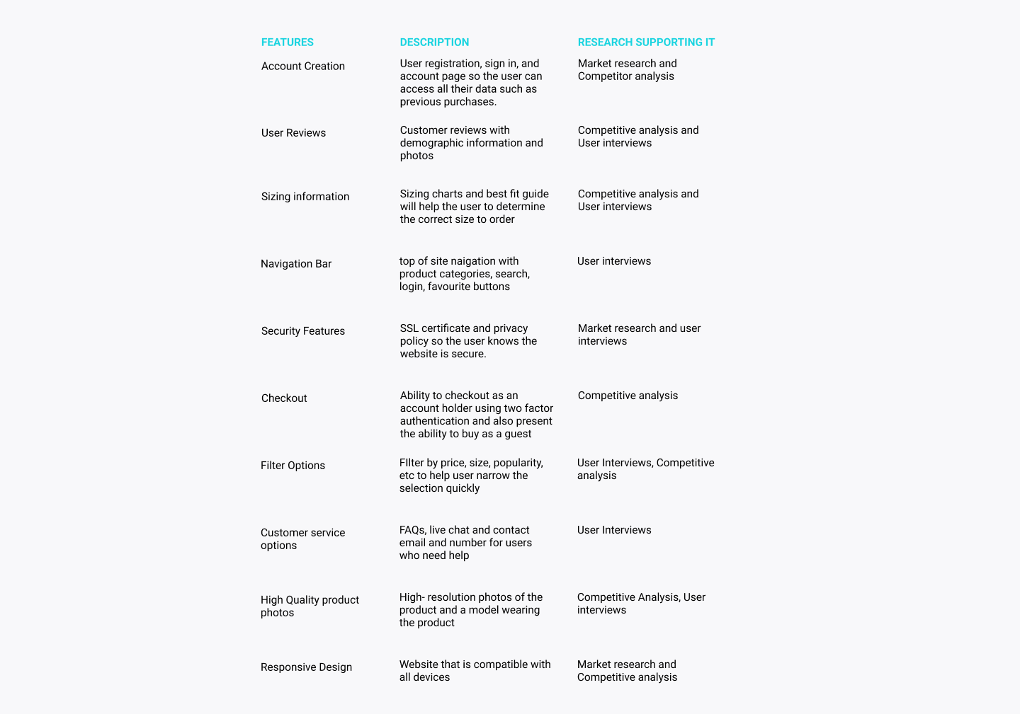
- Feature Listing
- Information Architecture
- Open Card Sorting
- Sitemap
- Task flow
- User Flow

Technical Goals
- Security features for safe payment process
- A responsive interface that looks clean and organised on all platforms
- Website meets W3C Web Content Accessibility Guidelines so users with disability
can use the site
- Chat with a representative feature should be present throughout the process
Features & Information architecture
I created a list of site features to further define and guide the vision for the product.


Findings
I was under the assumption that the ecommerce navigation system needed modifications, however after the cart sort the participants feedback revealed they were infact happy with it. While confusion did steam from not knowing where to place the miscellaneous items, the categories used in the industry seem to be efficient and understandable for the user.
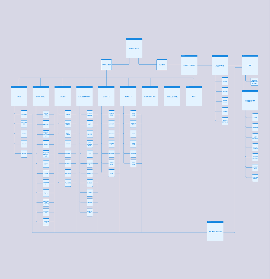
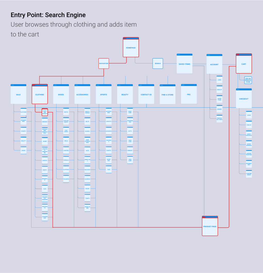
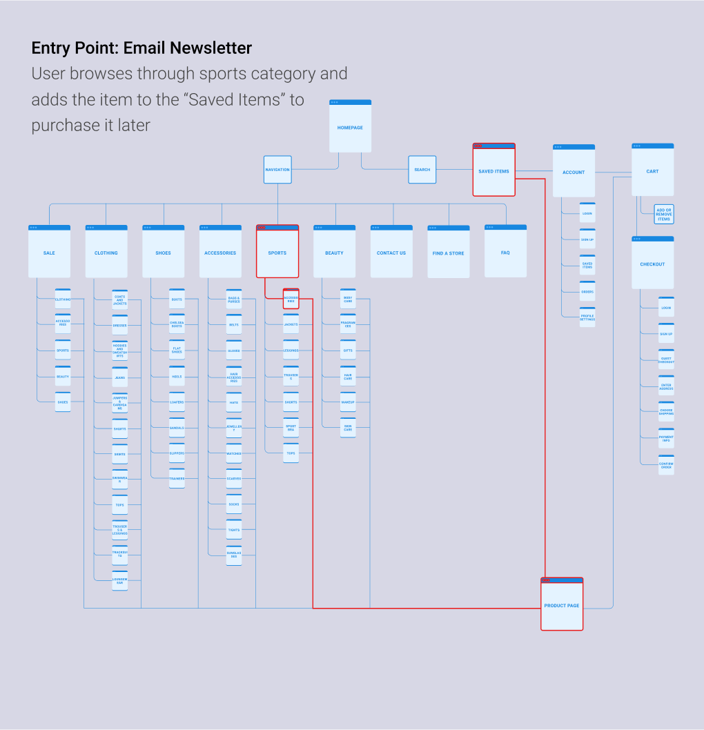
Based on the data i created a sitemap for the website which laid out the structure and the organisation of the content on the site
Sitemap
Based on the straightforward categories along with additional pages - contact, archives, disclaimer and about me, I created a site map which laid out the structure of the site.

Interaction Design
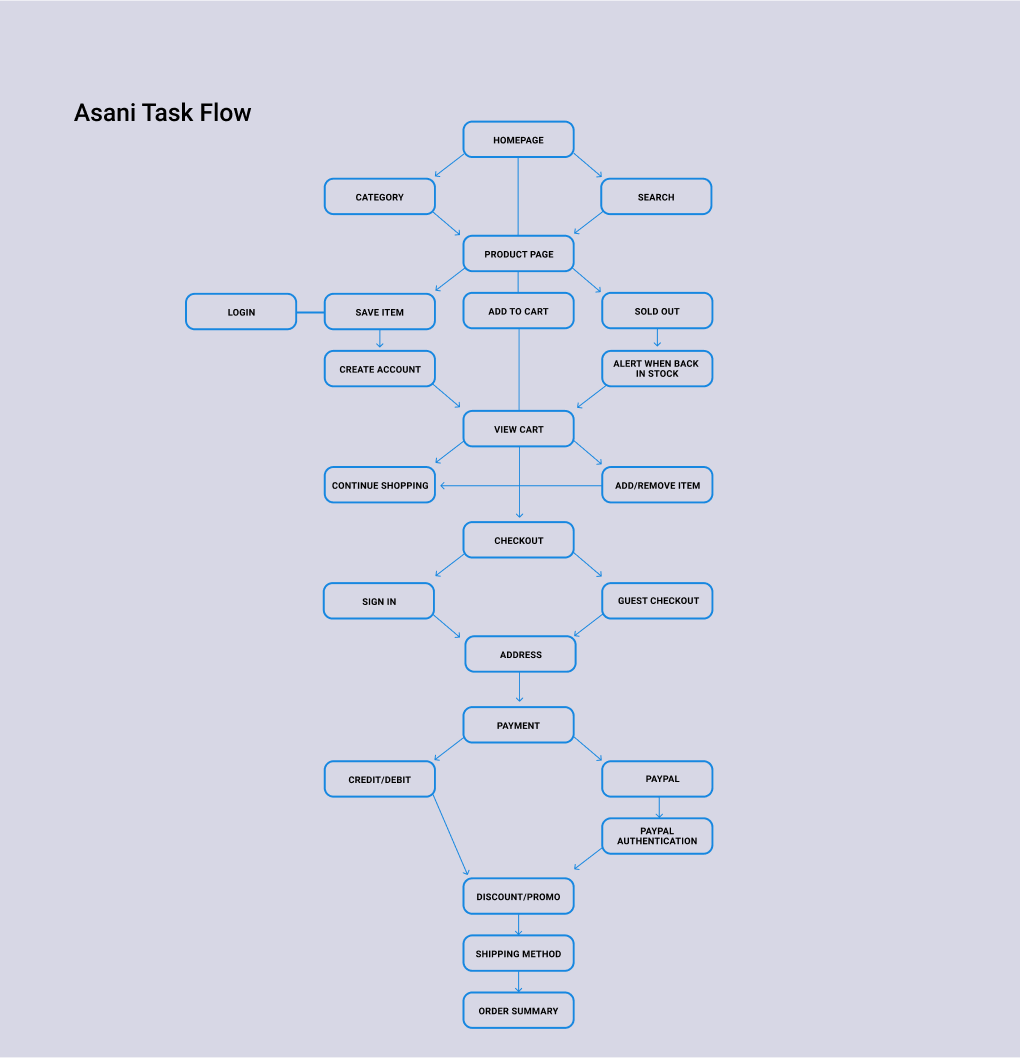
To understand the different ways of users navigating through the website to achieve their goals I constructed a task flow and user flow. These tools allowed me to make sure that the information was organised in a way that is intuitive to the user.


Taskflow

Design & Prototype
Visual Design
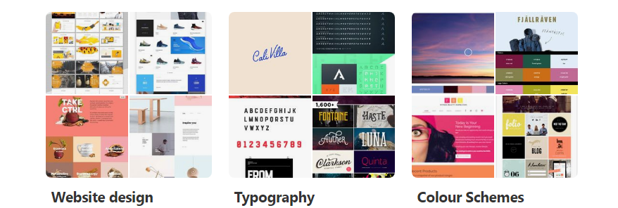
At this point of the design process, I began thinking how the website should look like to the visitors. I came up with a series of words that aligns with Asani’s brand: Modern, quality, affordable, stylish and Fresh.
I made mood boards on pinterest where I collected pins of typography, colour schemes and different web designs that matches with Asani’s image.

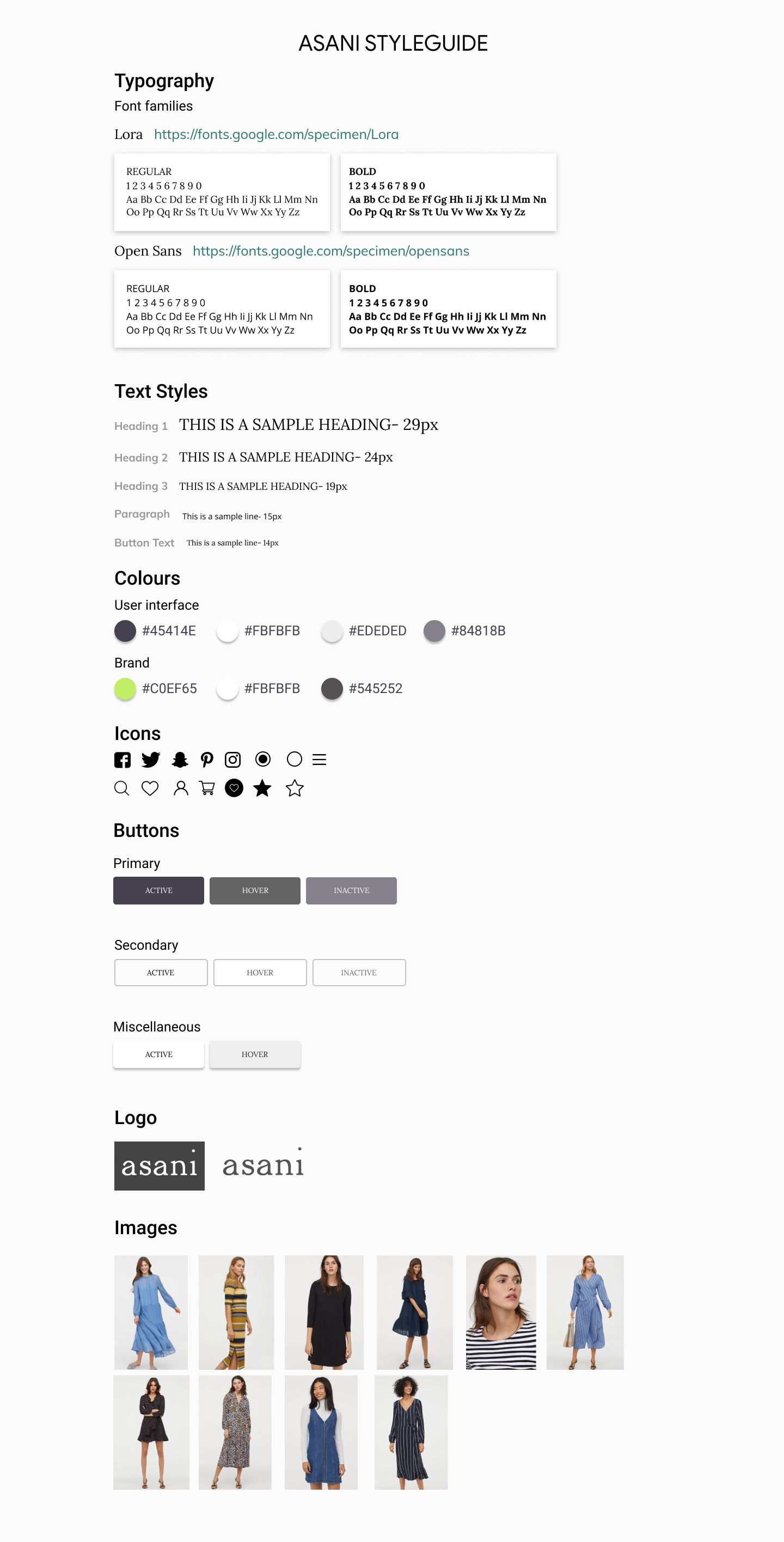
Styleguide
The logos were added to the Style Guide and UI Kit, a comprehensive collection of all site components and UI patterns. Both documents are constantly changing as the website and brand grow.


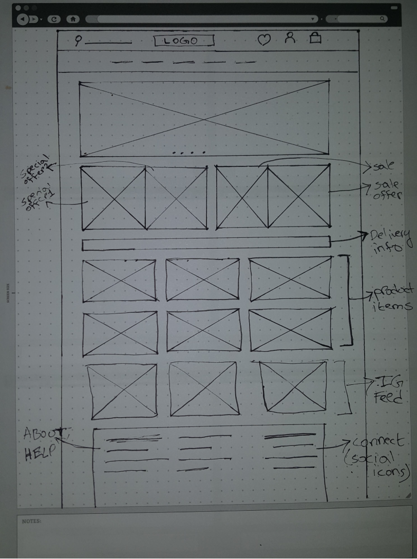
Low Fidelity wireframe
During this process I thought of how the layout of the website be and to structure the content to satisfy user and business goals in a feasible way. The sketch I chose for this project served as a guide for my digital wireframes.

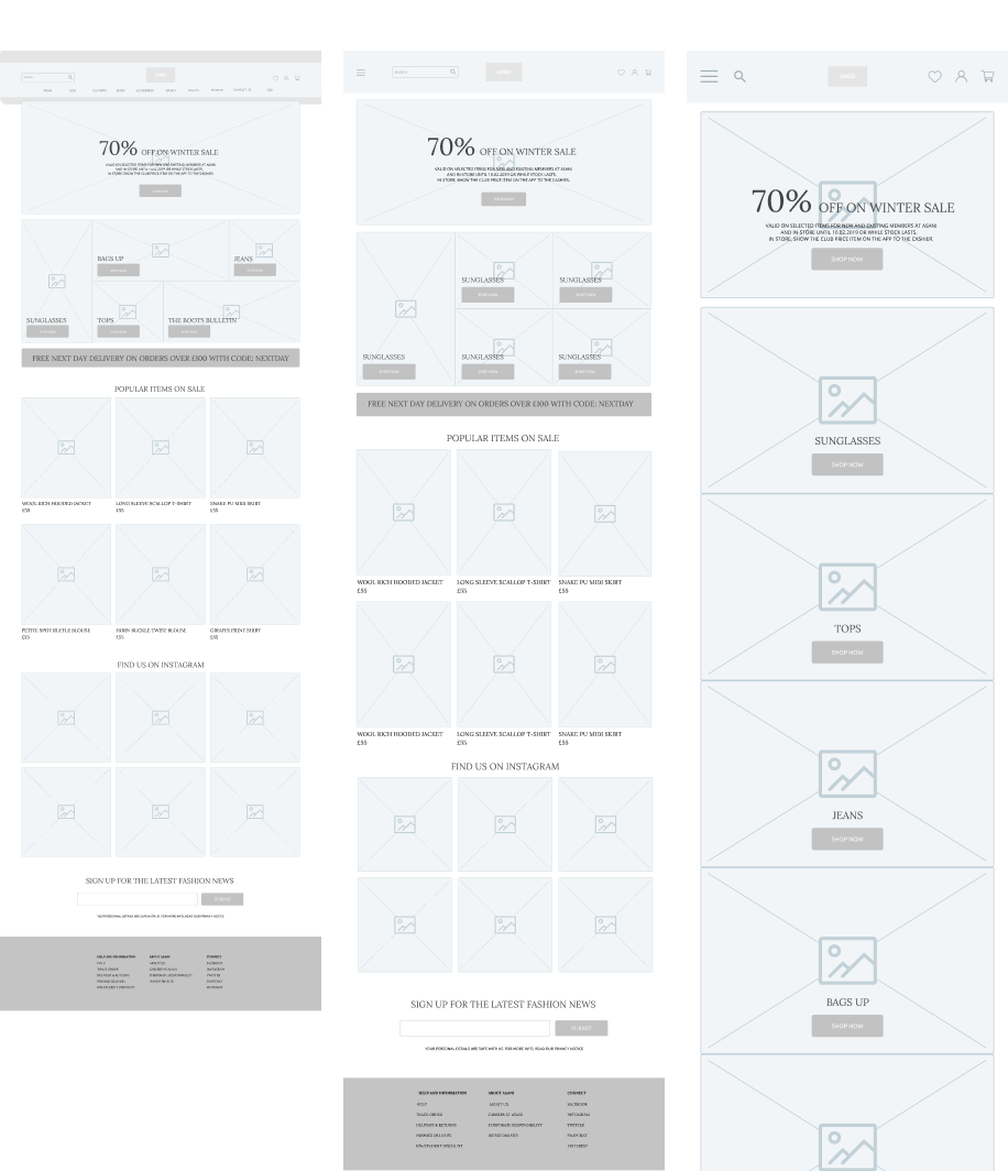
Mid Fidelity Wireframe

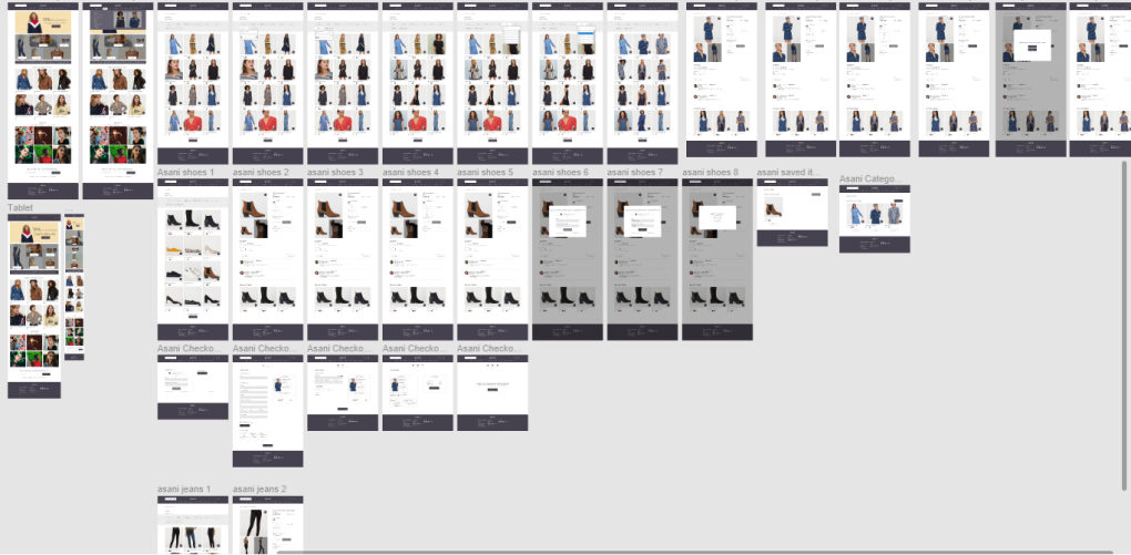
High Fidelity prototype
After several iterations of my low-fidelity prototype, I fleshed out the details of each page with images, typography, navigation menus, etc.

Testing & Iteration
At this stage of the design, after completing the high fidelity prototype I ran the usability testing with 3 participants. The test was carried out to examine usability, navigation, content & call to action in the built task flows; identify errors and gain user’s feedback on their preferences and recommendations and assess the overall success of the prototype. The test was conducted via a moderated remote setting.
Usability Testing
For the 5 participants chosen for the testing (who had similar backgrounds to our personas) they were given three different scenarios and were asked to complete the following tasks:
- Browse the site to read the articles of categories that interests them
- Use the search bar to find a post
- Share their opinion through the comment box
- Share a post on social network
- Signup for the newsletter
The participants for the usability testing were the same participants recruited for the interview and were asked to complete the following tasks:
- Find a pair of shoes and save them. Then, go view your saved items list.
- Find a pair of jeans and navigate to the customer reviews section of the product page.
- Find a blue dress under £50, and add it to your cart.
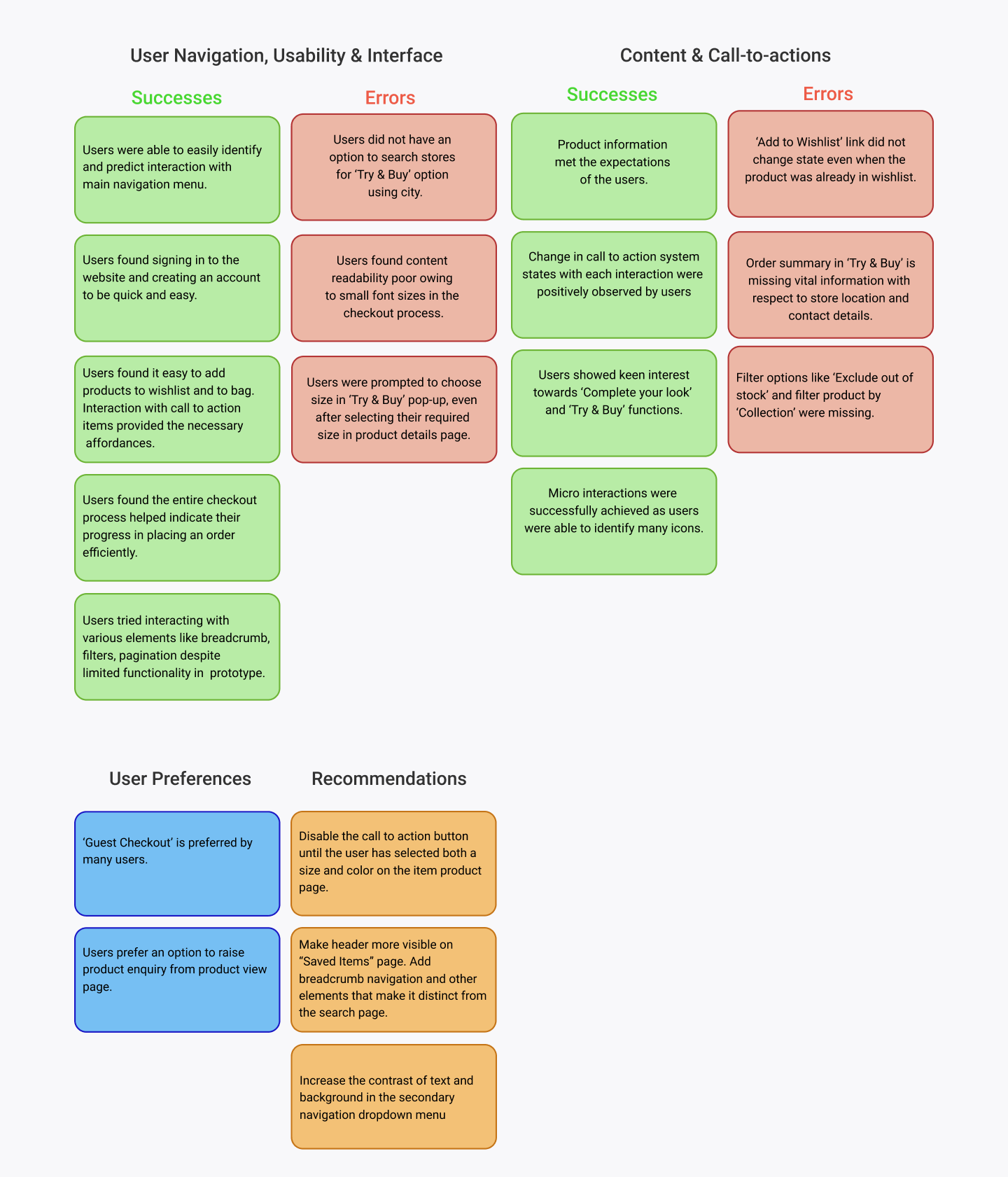
Affinity Mapping
I created an affinity map to organise and synthesis the responses and observations, I captured during testing. I uncovered insights, which I reconstructed into a list of recommendations so that it can be implemented on to the prototype.

Takeaway
Working on this project was a relatively straightforward task because many features have well established design patterns. Therefore I gained a lot of experience in researching and formulating solutions based on user and business needs . On top of that since many people use ecommerce sites on a regular basis, the information gathered and their expectations were concrete, which makes it crucial to reflect common design patterns to be integrated into Asani’s website. From what I have gathered from this project is that Usability testing can be a big help in discovering areas that are inconsistent with user expectations. Overall, I gained much perspective and understanding about the e-commerce experience.
View the prototype
Next
A Reason To Change
Designing & developing a website for an upcoming blogger aspiring to have her own blogging platform but in order for it to thrive in this competitive space is to understand the user needs, make content more socially engage-able and to take into account of the factors that will help her platform grow.
Previous
Little Joys
An upcoming blogger aspiring to have her own blogging platform but in order for the blog site to thrive in this competitive space is to understand the user needs, make content more socially engage-able and to take into account of the factors that will help her platform grow.
